Cafes and the White Population in Baltimore City
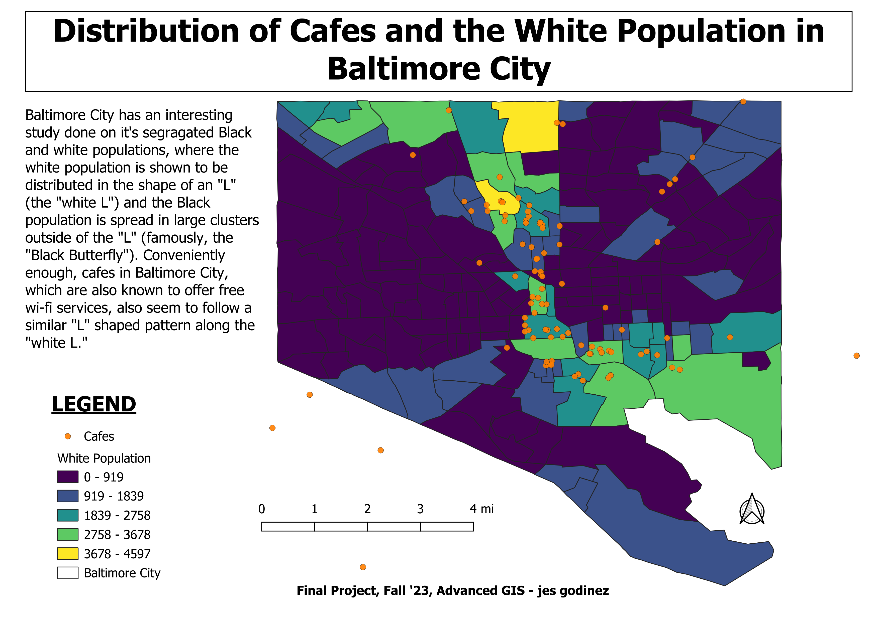
For this project, I decided to map coffee shops, or cafes, distributed throughout Baltimore City. I love going to coffee shops to enjoy a well brewed cup of coffee, that tends to cost around $4-7 per cup, and sit for hours and work on homework or work projects, usually using their free WiFi. Selfishly, I mapped these points to see if I could learn about new coffee shops I could visit. I also compared the locations of cafes in the city to the location of non-hispanic white population residencies, according to census data. Unsurprisingly, the coffee shops align with the white population almost perfectly.
Baltimore City has a huge racial segregation problem that dates back to the 1800s, Antero Pietila does a great job explaining the history in his book Not in My Neighborhood, (https://www.anteropietila.com/not-in-my-neighborhood). In 2021, the racial segregation was once again exposed by Dr. Lawrence T. Brown, in his book The Black Butterfly: The Harmful Politics of Race and Space, (https://theblackbutterflyproject.com/Book.html). He used the imagery of a butterfly to show its wings representing the Black population living on the outskirts of the prime real estate areas in the City, which run between and around downtown to Johns Hopkins University, and the body of the butterfly, in the shape of an “L,” representing the majority of the white population in the city. My project further exposes how certain resources are distributed amongst different racial groups.
I used data from the 2021 American Community Survey (5-year estimate) and OverPass Turbo. I used R Studio to call in my census data and manipulate both my datasets. I then used QGIS to create the map layout I have pictured below.